

Analytics
What you lose when you share an analysis as a screenshot
A screenshot carries the number without its date range or its filters. A month later nobody can check it. Here's what to share instead.
2 min read
Most daily work in an analytics tool isn't analysis. It's re-setup: pick the date range, pick the platform, exclude cancelled orders, pick the channel, pick the store. Then the work starts.
That's the visible cost, and it's the smaller of the two.
Those minutes read as friction. Friction reduces how often anyone opens the tool, and that reduces how many decisions get made from numbers rather than from memory.
The tool doesn't fail loudly. It gets opened weekly instead of daily, then before meetings instead of weekly, then only when someone asks a question. By that point it's become a place you go to justify a decision rather than to make one, and what got it there is small repeated friction rather than missing data.
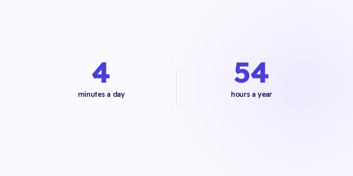
Before your real work starts there's a small ceremony every morning: open the dashboard, select last 7 days, filter to the right store, exclude cancelled orders, pick the channel, and now you can look at the thing you came for. Nobody counts it as work and everybody does it. A saved view makes those four minutes a one-time cost, and a shareable link means the rest of the team never pays it at all.
The common way to share an analysis inside a team is a screenshot in WhatsApp.
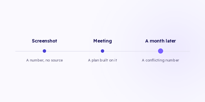
The screenshot has no filters, no date range, and no way to check what produced it. A month later nobody can say whether it included cancelled orders or which store it covered. It gets forwarded, someone quotes it in a meeting, and then a different number contradicts it and nobody can reconcile the two.
A saved view with a link is the same information plus its own provenance. See sharing an analysis.
Three tests:
Most teams need three or four views in active use, not thirty. A library of saved views nobody opens has the same problem as the dashboard it was meant to fix, so archive what you don't use.
Some views are personal and some are shared. The daily check is personal, but the analysis you argue from should be shared, because a shared link is what makes the argument checkable.
In Flowfy, filtering by period, channel, store and campaign is live, so every view described here can be built on demand. Saving a view, naming it and sharing it by link are on the roadmap and haven't shipped. Until they do, the practical substitute is documenting the filter combination somewhere the team can find it, which is worse than a link and considerably better than a screenshot.
Watch yourself for two days and write down the filter combination you set every morning. If the same combination comes up twice, document it somewhere the team shares, then see how often anyone opens the tool next week compared to the week before.
A screenshot carries the number without its date range or its filters. A month later nobody can check it. Here's what to share instead.
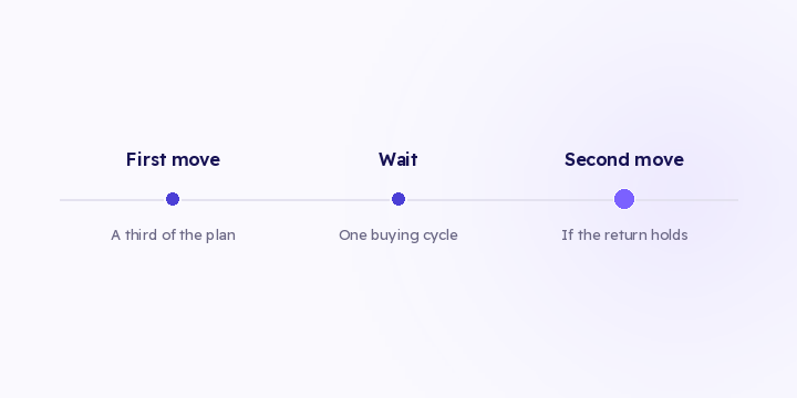
The distribution check tells you there's an opportunity. Moving it all at once eats most of it. Here are three execution rules, and what to watch afterwards.
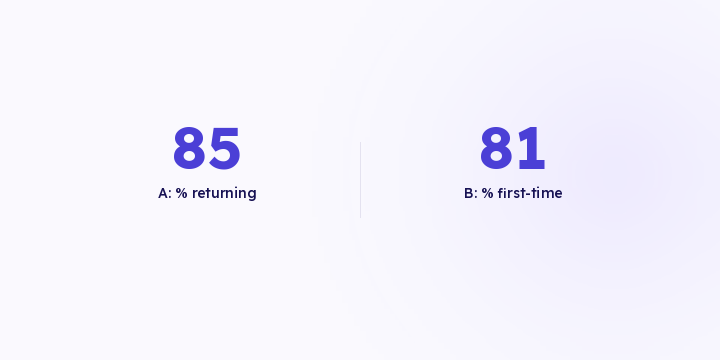
Two products with the same revenue can need opposite budgets. One buys you new customers, the other is why they come back. Revenue alone doesn't tell them apart.