

Analytics
Four lines instead of a weekly report
A number on its own tells you nothing. Four lines with a comparison, the top source, the biggest change and one suggested action take fifteen seconds and end with a decision.
2 min read

Every store has reports. Very few have a report anyone opens twice.
The gap isn't data availability. Most reports are built to prove that everything is measured rather than to produce a decision. Those are two different goals, and the report usually serves the wrong one.
Fourteen pages, with three consistent problems.
No hierarchy. Every metric carries the same visual weight, so the reader has to work out importance themselves. On a phone, with two minutes, they don't. They close it.
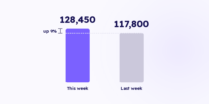
No comparison. A number without a reference point says nothing. 128,450 SAR tells you nothing until it sits beside last week, or the same week last year, or the target.
No conclusion. The report ends in data instead of ending in what to do. Someone still has to read it, form a view and propose an action, and that someone is busy. The report waits a week, and then it's stale.
Four things, in this order:
Everything else is an appendix. If it doesn't serve one of the four, it belongs on a screen someone opens deliberately, not in a document you send out.
Item three decides item four: the suggested step comes out of the biggest movement, because that's where a decision is available this week. And if the step turns out to be wrong, there's no real harm. It's a prompt rather than an instruction, and its job is to get the right person to open the right screen.
A four-line summary isn't a weaker version of a fourteen-page report. It has a different job: you open the report when you want to investigate something, and the summary tells you when to open it.
Most recurring reports go the same way. They start focused, and every time someone asks a question another section goes in, until the summary has grown into a report nobody opens.
What stops it is a simple rule: nothing gets added unless something comes out.
If the report needs a laptop to open, you'll read it on a quiet day and skip it in the week that mattered. Delivery decides whether the content lands at all.
Two practical rules: the summary goes where the team already looks each day, and the full report lives somewhere they can open when the summary tells them to. See a weekly digest.
If management or your partners want everything, what they actually want is to be able to see everything whenever they choose. Give them access to the full report and send them four lines.
Every figure in the summary you send should come from a query that's already defined. You're assuming nobody opens the report behind it, so if the summary calculates anything itself, it can be wrong and nobody notices.
In Flowfy, revenue by source, period comparisons, attribution trends and the queries behind them are live, so the content of the summary is available on demand. Sending the summary automatically on a fixed schedule is on the roadmap and hasn't shipped. Until it does, the substitute is a fixed weekly slot where you open the dashboard and read the same four things, which is a manual step, so it lapses easily in busy weeks.
Take your current report and pull four lines out of it: the headline number with its comparison, the top two sources, the biggest movement, and one step. Send the four lines and leave the long report where anyone who wants it can open it.
A number on its own tells you nothing. Four lines with a comparison, the top source, the biggest change and one suggested action take fifteen seconds and end with a decision.
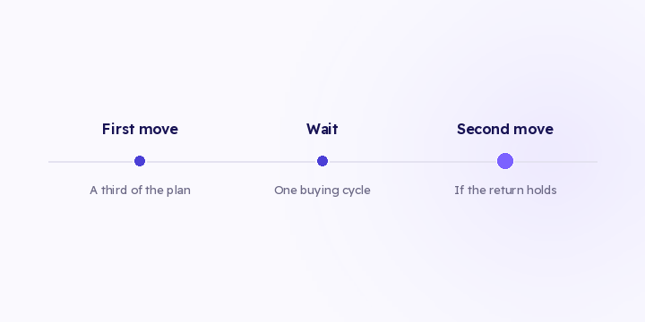
The distribution check tells you there's an opportunity. Moving it all at once eats most of it. Here are three execution rules, and what to watch afterwards.

Two products with the same revenue can need opposite budgets. One buys you new customers, the other is why they come back. Revenue alone doesn't tell them apart.