A number on its own tells you nothing. Four lines with a comparison, the top source, the biggest change and one suggested action take fifteen seconds and end with a decision.
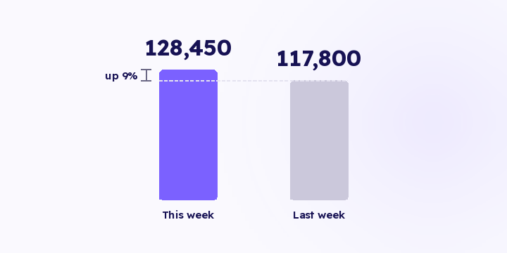
Revenue was 128,450 SAR this week. Up or down? Against what? A number with no reference point is news. You can't act on it, so you stop opening the messages that carry it.
Three things turn it into a decision: a comparison period so the direction shows, a composition so you know what produced it, and the biggest change, because change is where the decision lives. The fourth is a suggested action, and that's what separates a report from something you act on.
Revenue 128,450 SAR, against 117,800 last week, up 9%.
Top source delivered 41% of revenue, or 52,665 SAR.
Biggest change: one channel's ROAS fell from 7.4× to 3.1× in a week.
Suggested action: review that channel's creative before raising its budget.
Fifteen seconds, and you come out knowing whether the week was good and which screen to open first.
The biggest change isn't the biggest number. It's the largest difference between this week and last: ROAS falling, new customer cost rising, or a source dropping off the list. A number that didn't move doesn't earn a line.
You get one, but you don't read it. The delivery channel isn't a small detail here. A message that arrives where you already are gets read, while email sits in a pile of things for later, and later doesn't arrive during a season.
The test is simple. If the summary needs you to open a laptop, you'll read it in quiet weeks and skip it in the weeks it mattered most.
The four lines are a constraint, not an omission. A summary that grows becomes a report, and you're back at the problem you started with. If you need a fifth line, remove one of the four rather than adding to them.
Detail belongs in the dashboard. The summary's job is to send you back there when something is worth looking at. Most tools you stopped opening weren't weak; there just wasn't anything bringing you back to them.
It's a prompt, not an instruction. Its job is to get the right person onto the right screen, and that's most of the value.
There's one condition on where the numbers come from. Every figure in a summary like this has to come from a predefined query. If a language model is used, its role is phrasing the sentence, not computing, rounding or guessing. A summary that calculates on its own can be wrong in a way nobody checks, because the whole point of it is that nobody opens the report behind it.
The content of those four lines is live in Flowfy today: revenue by source, period-over-period reads and attribution trends. The scheduled summary delivered over WhatsApp is on the roadmap and hasn't shipped.
Until it does, set a fixed weekly slot to open the dashboard and read the same four things in the same order. During a season make it daily rather than weekly, and read alerts that matter before you start.
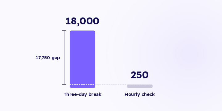
A three-day tracking break at peak spend exposes you to 18,000 SAR. An hourly check brings the same exposure down to about 250. The difference isn't the fix, it's how long you ran without seeing.
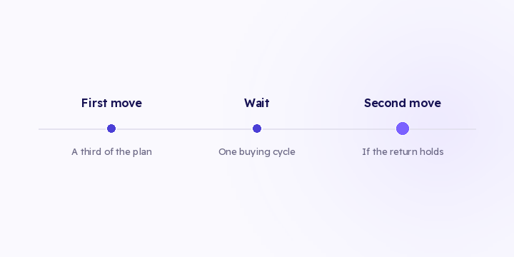
The distribution check tells you there's an opportunity. Moving it all at once eats most of it. Here are three execution rules, and what to watch afterwards.
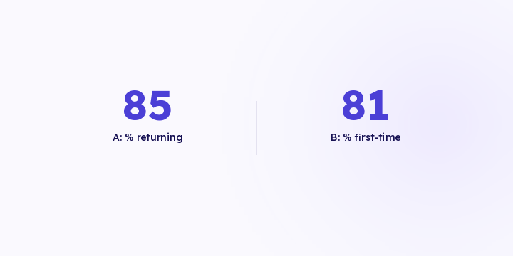
Two products with the same revenue can need opposite budgets. One buys you new customers, the other is why they come back. Revenue alone doesn't tell them apart.